GIS Website Implementation Examples
|
|
The following illustrations of GIS Website's technical implementations represent
both past and current work, delivered under the aegis of either GIS Website, IBM
or Local Knowledge Consulting (as cited below). A subset of many more client engagements,
these projects are some of the largest or most innovative in our portfolio.
|
|
Metaweb's (now Google's) Freebase
|
Metaweb Inc. was a startup company graced with 57
million dollars of venture capital to build a Creative Commons semantic dataset of "the
world's knowledge." Metaweb was acquired by Google for an undisclosed amount in July, 2010. Metaweb calls their dataset "Freebase"
and has opened it to public input since 2007. As Freebase's dataset grows, three
types of information have emerged as pervasive "glue" types that unite otherwise discrete data
elements: People, Business and Location.
Initially, Freebase supported only point geometries, representing a location as a latitude
and longitude and enabling searches within simple user-defined regions (e.g. latitude < 38.5 and > 36.0, etc.).
GIS Website assisted Metaweb with the extension of Freebase's spatial functionalty to store linear
and polygonal geometries and to support spatial queries against those geometries.
Metaweb encourages public participation, so endorsed a geospatial architecture that reused
existing open-source software with an active user-base, specifically the Postgresql + Postgis
spatial database. Freebase users can now query using standard geospatial comparison functions
involving distance, contiguity, intersection and so on, both for geometries created on-the-fly
or for comparisons between existing Freebase geometries.
The video at right provides an 8 minute summary of
Freebase and its spatial capabilities, as delivered by GIS Website's
Jonathan Lowe at the
2008 O'Reilly Where 2.0 conference.
Freebase users can now query using standard geospatial comparison functions
involving distance, contiguity, intersection and so on, both for geometries created on-the-fly
or for comparisons between existing Freebase geometries. Specific to a semantic datastore, users
can also extend a geographic search to include what Metaweb calls "relevance". In other words,
the search results can be filtered not only by geometry but by the other data elements' degree of similarity to a source topic.
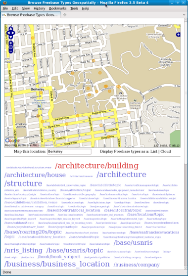
The below two illustrations are OpenLayers and Google mashups for browsing Freebase geospatial data for an area of interest,
such as Berkeley, California. The Freebase topics containing geometries appear as tag clouds below the maps;
semantic types with the most topics appear with larger font sizes than types with just a few topics.
|
 |
 |
|
The above mash-up combines data from Freebase and Google and spatial javascript libraries from OpenLayers. The selected type is "/architecture/building" so the map displays the locations of Freebase's noteworthy buildings for that region of Berkeley, California. The tag cloud's variations on architecture types -- building, house, structure -- illustrates the flexibility of a semantic data model: any individual geometry may be linked to more than one type. |
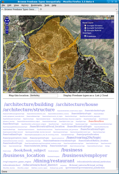
Following the integration of complex spatial types and functions into Metaweb's architecture, users can now store, retrieve and search within polygonal regions of any shape, such as the extent of the Oakland Hills firestorm shown above. The small sliver at the bottom of the burn area shows where airborne cinders leapt over the freeway to start a new burn area.
|
Challenges encountered in delivering this spatio-temporal semantic database integration:
- At a technical level, preserving the existing (non-relational) data store's retrieval performance speeds was the ultimate challenge. Scott Meyer's strategy was to handle geometric data independently from the core semantic data store, as geometries could contain any number of vertices and hence unpredictable processing times.
- Establishing consensus about the best data model for location data was more difficult in the organizational chaos of a start-up than in a corporate culture's top-down direction. This was compounded by the need to agree the model not only internally, but with the user community.
|
- All of Freebase's data is required to fit the Creative Commons definition if it is loaded into the official database. Finding geographic data of this stripe is not easy after finishing with TIGER datFinding geographic data of this stripe is not easy after finishing with TIGER data. As Tim O'Reilly commented in Where 2.0, "It's a great idea, but it still needs more data to be really sueful."
|
|
For more information, please contact us.
|
|
|
City of Berkeley, California, Neighborhood Mapping
The City of Berkeley Neighborhood Mapping site's purpose is to provide Berkeley residents with a
comprehensive view of local conditions: social, commercial, environmental and historic.
The site consolidates and overlays a clean basemap with formerly distributed thematic data on
Crime, Demographics, Events, Fire, Geology, Hydrology, Real Estate, School Districts (3 levels), Soils,
Topography and Zoning. Users select a location (typically their home address) and step through each
theme to form a comprehensive understanding of that locality -- liquefaction hazards, real estate
sales histories, earthquake fault lines, and so on.
This project demonstrates the feasibility of building an entirely free and open-source
spatio-temporal website. The site's business logic and navigational and address geocoding capabilities
are coded in Perl and UMN Mapserver's Mapscript module. The map rendering engine is UMN's Mapserver.
The database, which becomes indispensible for temporal data management, is PostgreSQL spatially extended
with Refractions Research's PostGIS.
The operating system is FreeBSD Linux and the web server is Apache. Data capture, cleansing
and transformation involved various tools and libraries including the FWTools suite and free
desktop editing packages such as Quantum GIS, OpenJUMP and uDig, depending on the need.
Performance is competitive with commercial alternatives, returning real-time (i.e. non-tiled)
maps in less than two seconds for non-concurrent requests. With some exceptions, third-party software
documentation is good. Mapserver's cartographic capabilities, particularly for annotation, are not as
user-friendly or full-featured as commercial alternatives, but are adequate for producing readable
maps.
 |
 |
|
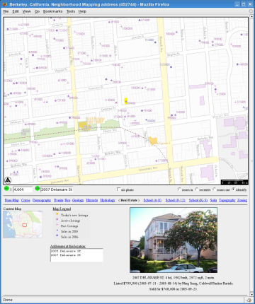
Berkeley Real Estate map plotting listing and sales histories
with (some) facade photos from 2004 to present. |
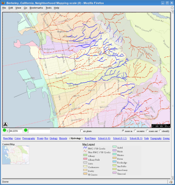
Berkeley Hydrology (watersheds and creeks) map displaying
which segments of each creek qualify as surface flows and thereby constrain the
building permits for intersecting and nearby properties.
|
Challenges encountered when building this presentation tier spatio-temporal application:
- Presenting multiple overlays to public users but keeping each thematic grouping
cartographically readable.
- Aggregating data that grows over time (such as crimes) for visual clarity,
but enabling users to investigate details (such as invidual incidents).
|
- Building a browser-based interactive spatio-temporal site without spending any
money on software.
- Enabling a variety of navigation and query capabilities using a minimum of
controls (seven in this case).
- Converting disparate data sources to common quality levels
|
|
The Berkeley Neighborhood Mapping application is for demonstration purposes only,
so is not normally accessible to the public. If interested in test driving the
application, please contact us.
|
|
|
UK Department for Environment, Food and Rural Affairs (DEFRA):
Spatial Information Repository (SPIRE)
DEFRA is an umbrella department encompassing many land-related disciplines, each of which
generates spatial data and mnay of which need to share that data across divisions or with the general
public. The SPIRE programme's purpose is to improve the efficiency of data sharing within DEFRA,
to improve the data quality of shared spatial datasets and to speed up spatial data analysis
by offering a variety of formats and hosted processing services to professional GIS operators.
SPIRE's architecture includes very large datasets (such as Ordnance Survey's MasterMap), several Oracle
Spatial databases, UMN's open-source Mapserver rendering engine, and a Web Mapping Service-based IBM
Websphere Portal interface. The hardware platform is a collection of IBM p-series servers running
the AIX 5.3 operating system.
DEFRA is an enormous government entity, and SPIRE is only one of hundreds of projects for which
IBM manages the information technology. Consequently, before the project ever began, a shared IT
infrastructure specification was already in place making use of the AIX 5.3 operating system and IBM
supporting software (e.g. Websphere, MQ-series, etc.) the most cost-effective design path.
Unfortunately, no map rendering software ran on 64-bit AIX 5.3 at design time, so the team ported UMN's
Mapserver to AIX. IBM is a Java shop and Mapserver is written in C; consequently, the team designed
and built a multi-process Mapserver engine fed by an MQ-series message broker to handle Mapserver process
failures outside of the Java environment, satisfying reliability and availability targets.
Building the presentation tier using a collection of "portlets" such as the "Map Viewer" portlet or
the "Search Location" potlet, enabled developers on other DEFRA projects to build mapping functionality
into their applications simply by registering the desired SPIRE portlets in their own Portals
with a minimum of additional development effort or cost.
|
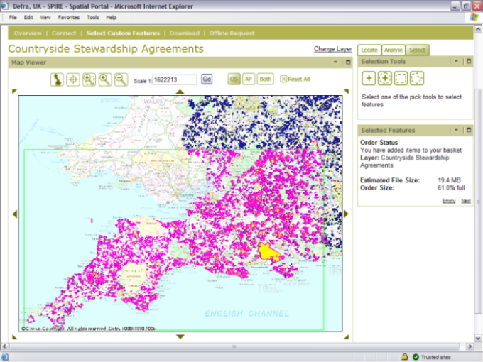
In this illustration, the IBM Websphere Portal calls an enhanced Web Mapping Service API
to draw both the backdrop image, the layer of interest (Countryside Stewardship
Agreements) and the user's selection.
Another API for transforming data between database and flat-file formats provides
an estimate of the output shapefile size and download time. |
 |
 |
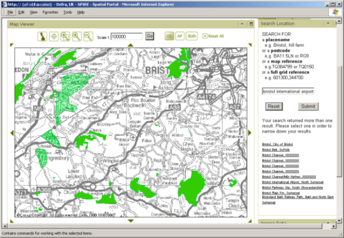
In this illustration, the SPIRE portal displays a portlet
interface to an underlying location based services API, in this case a gazetteer
enabling input of a placename and output of any matching candidates. Selecting a listed
candidate causes the map portlet to zoom and recenter on that place's
geographic location. |
Challenges encountered as technical lead on this spatio-temporal systems integration project:
- Integrating a wide variety of software within constraints of standards frameworks
(e.g. JSR 168 portal standard, OGC WMS specification, etc.)
- Designing web services APIs that withstand changes in requirements with minimal
need for redesign.
- Designing and implementing a temporal model for spatial features, spatial metadata
and system metrics.
- Wiring IBM Websphere portlets bi-directionally.
|
- Establishing user agreement on spatial data quality levels and validation
methods for assessing quality.
- Coordinating a team of a dozen IBM IT specialists and as many third-party
contractors and partners over a multi-year, multi-million dollar (pound)
project.
- Building a security model relating departments and individuals to each dataset
in the SPIRE collection and to capabilities in the SPIRE portal.
|
|
Due to data sensitivity and licensing restrictions, the UK DEFRA SPIRE portal is
currently an intranet-based application not available for public viewing. A subset of
publicly available data from the SPIRE collection is available at the
MAGIC website, an
ESRI ArcIMS-based site.
|
|
|
US Department of Agriculture's Farm Service Agency:
Business Process Reorganization
The USDA FSA subsidizes farmers who grow certain crops or follow FSA-recommended
ecological land management practices. The subsidy amount depends in part on the land
area involved and period of time of the activity, making temporal tracking of spatial activity
on any FSA-subsidized farm directly relevant to both the farmer's and the government's
bottom line.
The USDA FSA worked with IBM on a "business process modernization" effort intended to
improve the efficiency of the FSA's information management processes and to sweeten the FSA's
relationship with the farming community by consolidating the FSA's many forms and farming data
into a single system and unified public-facing website. Enabling that unified system to track
changes in land use raised the need for spatio-temporal data modeling of all subsidized farming
activities.

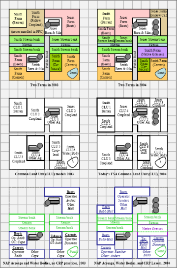
Because the FSA has multiple programs, each of which may
apply subsidy calculations to the same overall farm property, a significant
piece of their data modeling work involves clarification of "the rules" across
space, time and seasonal policy changes. This illustration shows our approach
for confirming rules, in this case, on valuing crop rotation. |

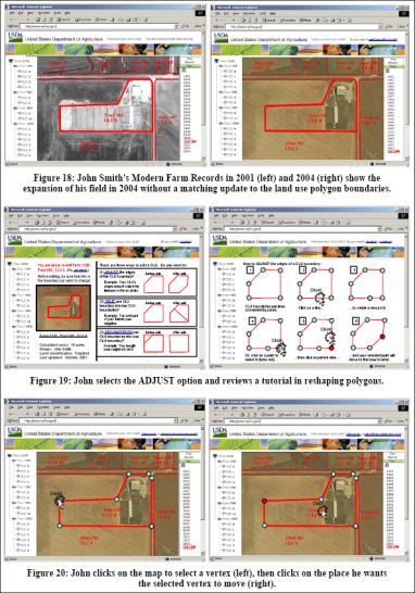
The FSA hoped to simplify their existing data collection processes
(mainly paper forms and field office representatives) by putting farm data online
and encouraging farmers to maintain their own spatial data directly. This illustration
shows a sample of the design proposals for such an assisted ditization interface.
|
Challenges encountered in modeling the USDA FSA's farm subsidies data and rules:
- Although constrained to the same land, different FSA policymakers
calculate subsidy payments based on different models, defying
consolidation in a single model.
- Improvements in spatial technology are not always welcomed by users; farmers
who had been subsidized for 10 acres of corn were not interested in adopting
a more accurate system if the more accurate acreage of 9.5 acres reduced
the FSA payout accordingly. A rules-based system tied to the data model
was our approach to managing such parallel views of the world.
- Collecting full business requirements before building any working applications
takes dedication on the part of both the consultants and the clients.
|
- Policy lifecycles do not start and end evenly; there are overlaps even within
departments. The temporal model had to handle comparisons of events that did
not perfectly match.
- The FSA's constituents are farmers first and technology users second;
any public-facing interfaces had to be highly intuitive and/or contain embedded
storyboard-style documentation.
- No single person at the FSA can unilaterally approve (and later vouch for) a
design proposal, so design decisions must be clearly recorded and
circulated among a changing group of stakeholders.
|
|
The resulting deliverable to USDA FSA was a 72 page report:
USDA FSA Modern Farm Records Requirements and Architecture Target.
|
|
|
UK's Rural Payment's Agency
The data in the RPA's Rural Land Register models a business case in which farmers claim subsidy payments from the RPA based upon agricultural activities carried out on land of known area. The RPA keeps track of the area of each of England's 2.2 million land parcels using a bespoke ESRI 8.3 MapObjects (Java) application deployed in 2005. Largely to avoid a "disallowance" penalty from the European Commission, the RPA endeavored to upgrade this legacy system from early 2008 to early 2010, assisted in part by GIS Website LLP.
The RPA's culture is mistake-averse, so any change must be planned, documented and agreed by a wide range of stakeholders. Because some of the concepts involved are complex, GIS Website's most valuable contribution to the upgrade effort was the demystification of the RPA's data model and existing vs. target business process flows. The most contentious elements of the design were often smoothed out following clarification of the problem or model. To accomplish this task, GIS Website authored detailed and heavily illustrated documents of conceptual and logical data models, process flows, storyboards and "solution blueprints" for review by both the RPA themselves and the army of suppliers and other contractors.
 |
 |
|
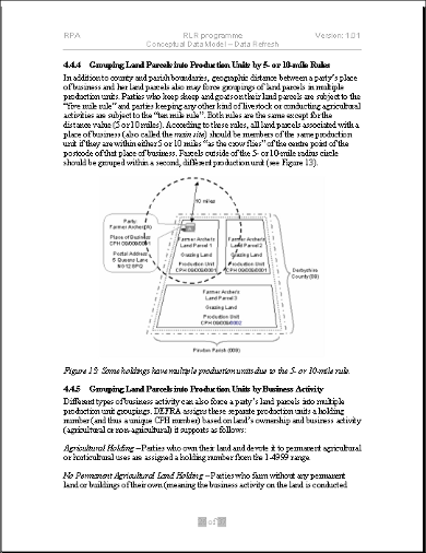
A sample page from the RPA's Conceptual Data Model document, authored and illustrated by GIS Website LLP. This page explains the assigment of County-Parish-Holding identification numbers to land parcels based upon the 5- or 10-mile rule. |
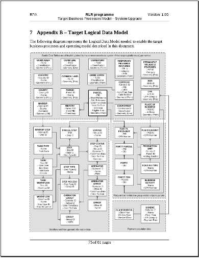
A sample page from the RPA's Logical Data Model initially established by GIS Website LLP. Upgrading the GIS happened in parallel with an upgrade and integration of the RPA's workflow system -- the gray areas distinguish GIS, workflow and associative entities from each other. |
 |
 |
|
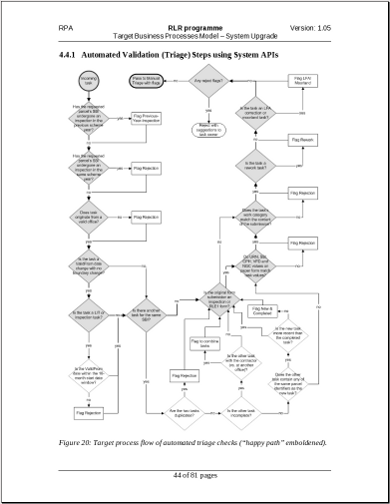
A sample page from the RPA's Target Business Process Model, authored by GIS Website LLP, shows the series of actions and decisions that the RPA's Triage Team must take when receiving a request to modify a GIS land parcel polygon to reflect some change in the real world. To improve readability of the flow, the "happy path" or ideal flow is highlighted in gray. |
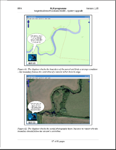
Conceptual illustrations, entity-relationship diagrams and process flow models are all useful and necessary to explaining a design, but are not always accessible to those unfamiliar with their notation, particularly at an executive level. Storyboards, however, have universal appeal because, if done properly, they translate long lists of dry, written requirements into a vision that the project's sponsors, users, developers and managers can all directly understand. This storyboard excerpt, authored by GIS Website LLP, illustrates the RPA's new process model and GIS Toolkit. |
Challenges encountered when building this presentation tier spatio-temporal application:
- The biggest challenge by far at the RPA was overcoming beaurocratic inertia to turn written design documents into live working applications.
- The RPA's spatial, temporal and associative data was rife with errors. Identifying them was relatively straightforward, but correcting them was much more difficult due to the network of legacy applications and partner agency processes depending upon RPA data on a regular basis. Data migration and cleansing activities consequently took on greater significance than usual.
|
|
For more information, please contact us.
|
|
|
Oakland Unified School District's (OUSD) School Finder and
Map Center
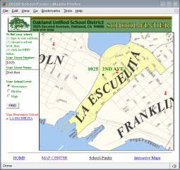
The original purpose of the OUSD's School Finder application was to reduce call volumes
to administrative staff at the beginning of each school term. Oakland is home to
over 50,000 students who are assigned to school sites based upon their age and
home address. The School Finder application replaced a text-based system and
put the information directly into the hands of the public that needed it.
Following School Finder's success, OUSD launched a second set of online maps
intended to assist Oakland's teachers with geography and local history lessons.
The interface was designed for (and tested by) school students, so was required to
be as intuitive to non-technical users as possible. At the time, there was very little
precedent or guidance for online interactive mapping site design, so the developer used
Edward Tufte's general visual design principles extensively, such as replacing image
buttons with words and maximizing the map on the page while reducing what Tufte
calls "chartjunk" (for details, see the GIS Website technical article,
Advanced Internet Map Server Techniques: Designing Intuitive
Websites for a Non-technical User Base).
The architecture is simple: a single Microsoft Windows and Intel server supports
a Visual Basic and ESRI MapObjects process that draws maps based on ESRI shapefiles.
Since its formal launch in 1999, the system has run with only minor changes to incorporate
new or updated datasets (such as when school boundaries change), a long-term return on the
initial one-year development investment, most of which involved data cleansing.
OUSD has tallied site usage since 1999; in 2007, the site exceeded one million map views.
 |
 |
 |
OUSD's staff were swamped with calls from
the public asking within which school boundary a particular street
address fell. This School Finder application dramatically reduced call volumes. |
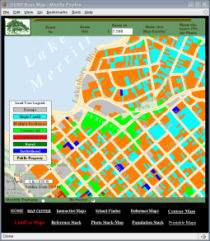
In addition to detailing OUSD
student-to-school assignment,
the Map Center made data from the City of Oakland's municipal GIS available to
the public, as shown here with landuse data.
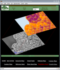
| Innovation in display to solve the
obscured choropleth problem and
to teach children about the differences in scale between imagery and abstract maps.
This map stacks population over an aerial photo.
|
Challenges encountered when designing and building this public interactive mapping website:
- Developing a browser-based mapping application with bleeding edge (at the time)
technology.
- Joining out-of-the-box spatial components (ESRI's MapObjects) with custom-coded
high-performing C modules for image modification not initially supported by
ESRI.
|
- Designing a user interface simple enough for school children to understand
intuitively.
- Presenting opaque choropleth maps (such as population density) without obscuring
the underlying reference features (such as roads and annotations).
|
|
To explore the live application, please visit the
Oakland Unified School District's Map Center, live since 1999.
|
|
|
City of Oakland GIS Data Conversion
The Oakland Hills Firestorm of October, 1992, prompted a bond measure by the City of Oakland to
improve the City's emergency response capabilities. Included in the budget was
a project to build an enterprise GIS for Oakland "from scratch" by converting
any data of potential value during an emergency. Jonathan Lowe served as technical
lead, subcontracting his team to CH2M Hill and reporting to Oakland's F. Michael Smith.
The project lasted over three years and generated a dataset that subsequently became
the basis of business applications in numerous oakland departments (including OUSD's
Map Center, above) and non-municipal operations such as the construction
and real estate industries.
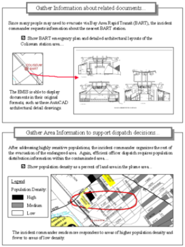
We surfaced data requirements by interviewing several emergency responders and
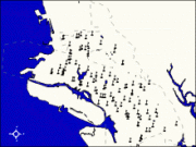
producing emergency
response scenarios, then recasting them as if the GIS was already available.
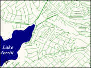
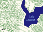
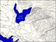
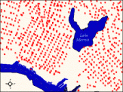
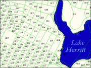
The requirements directed our data conversion efforts for spatial layers (see examples below).
Following intial deliveries, the list expanded to include non-emergency data as well.

|

School Sites |

Sewer Pipes |
 Land Parcels |
 Topographic Contours |
 Fire Hydrants |
 Census Blocks |
The data capture and conversion effort ran continuously from 1994 to 1997, resulting in the following
spatial layers (as well as an Oakland-wide quarter-inch pixel resolution B&W orthophoto collection
(flown by Hammon, Jensen, Wallen and Associates) against which
GIS data conversion specialists Kyle Draganov, Julia Howlett and Jake Schweitzer digitized, cleansed
and QA'ed the 61 vector datasets (listed below) using ESRI's Arc/Info
and ArcView software.
|
|
Boston, Massachusetts, Real Estate Mapping
In collaboration with Coldwell Banker, GIS Website built an OpenLayers mashup to support input by multiple parties in support of a consensus decision about buying property in the Boston metro area. Combining data from Boston's multiple listing service, Google Maps, MassGIS land parcels and locally captured neighborhood quality assessments enabled evaluation of each new property listing against every family member's criteria. The ability to record choices in a common database enabled everyone to see each individual's decisions about a property, the real estate agent's included.
 |
 |
|
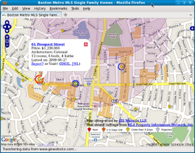
This view illustrates the use of a Google Maps backdrop mashed up with real estate listings point locations color-coded by the length of time they have been listed, circles marking a 15-minute walk from grocery stores (purple) and desirable neighborhoods (orange). Selecting a listing opens a speech bubble that allows individual users to request a tour of the property or to reject it. All users see each other's choices. |
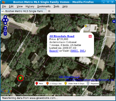
Demonstrating use of a different backdrop (Google aerial photography) with a superimposed Web-Map-Services (WMS) layer to reveal the assessor's parcel boundaries (with faint purple lines). While some property listings provide site maps, they rarely show the lot lines in the context of the surrounding neighborhood as this application does. The red and green circles around the yellow diamond in the lower left show a listing that both the realtor and one of his clients think would be worth seeing.
|
Challenges encountered when building this presentation tier spatio-temporal application:
- Although very useful once mastered, OpenLayers has limited documentation, so has a steep learning curve. Developers are expected to learn from the Javascript libraries themselves or to study a collection of examples.
- One of OpenLayers' strengths is its reuse of tiled commercial reference maps such as Google, Yahoo, Microsoft and OSM. However, these backdrops' "Spherical Mercator" projections require special treatment if the data being superimposed on them is a different custom projection, as is the case the MassGIS data in this application.
|
|
The Boston Real Estate Mapping application was built for a private client,
so is not on public display. However, if interested in test driving the
application, please contact us.
|
|
|
